SystemsCarbon Direct2023
Helping teams access spend data for carbon measurement
Carbon footprinting depends on spend data that sits with the finance team. I designed the guidance and upload experience that cut the back-and-forth between them.
- My role
- Product designer — research, journey mapping, interaction design, user testing
- Focus
- Product design, UX research, User testing, UI/UX
Context
Carbon Direct’s measurement tool calculates an organization’s footprint from two sources: operational spending and activity data.
Getting the spend data is the hard part. The people doing carbon footprinting don’t sit in finance, so they depend on a finance team to pull it — and the request almost always got messy. Unclear structure, format, terminology. Rounds of back-and-forth between two teams who don’t share a vocabulary.
How can we guide customers on what data to get, and where and how to get it?
The key decision
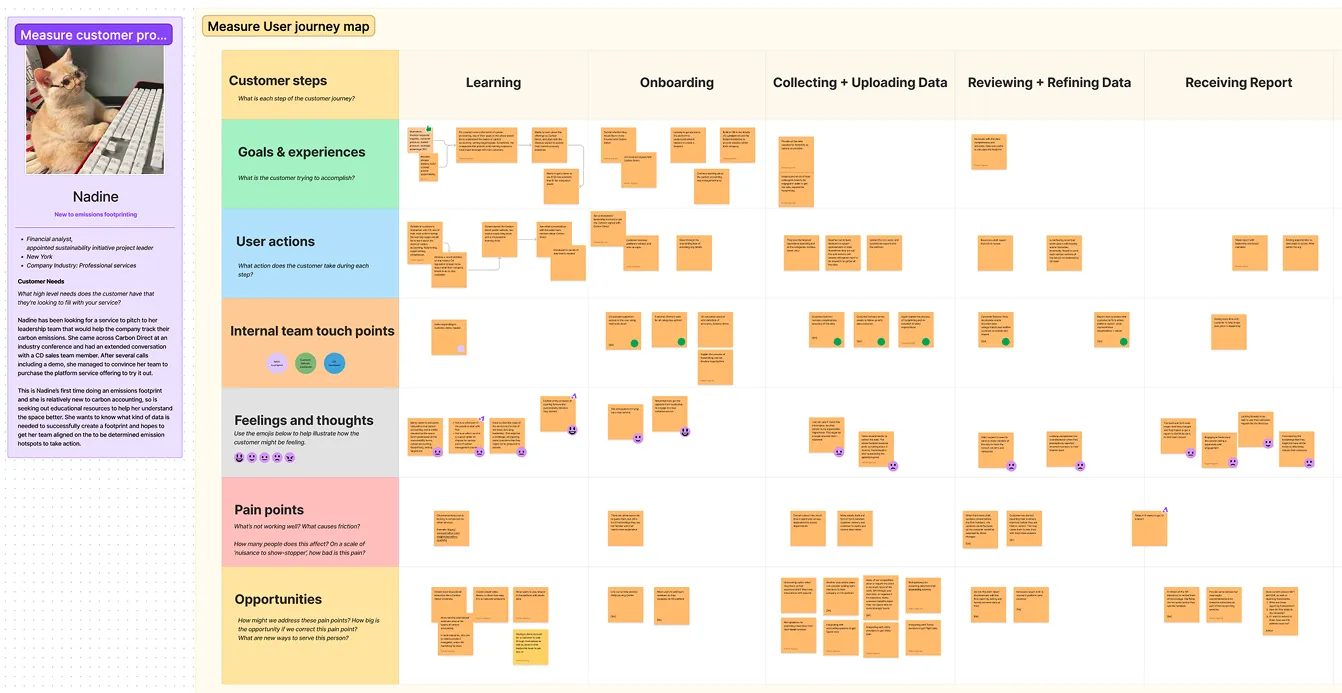
The failure wasn’t where the product showed it. Journey mapping placed the breakdown upstream of the upload step — in the request one colleague had to make of another. Mapping internal touch points alongside customer actions made the cost visible: every pain point had a matching hour of our accounting team’s time.
What I did
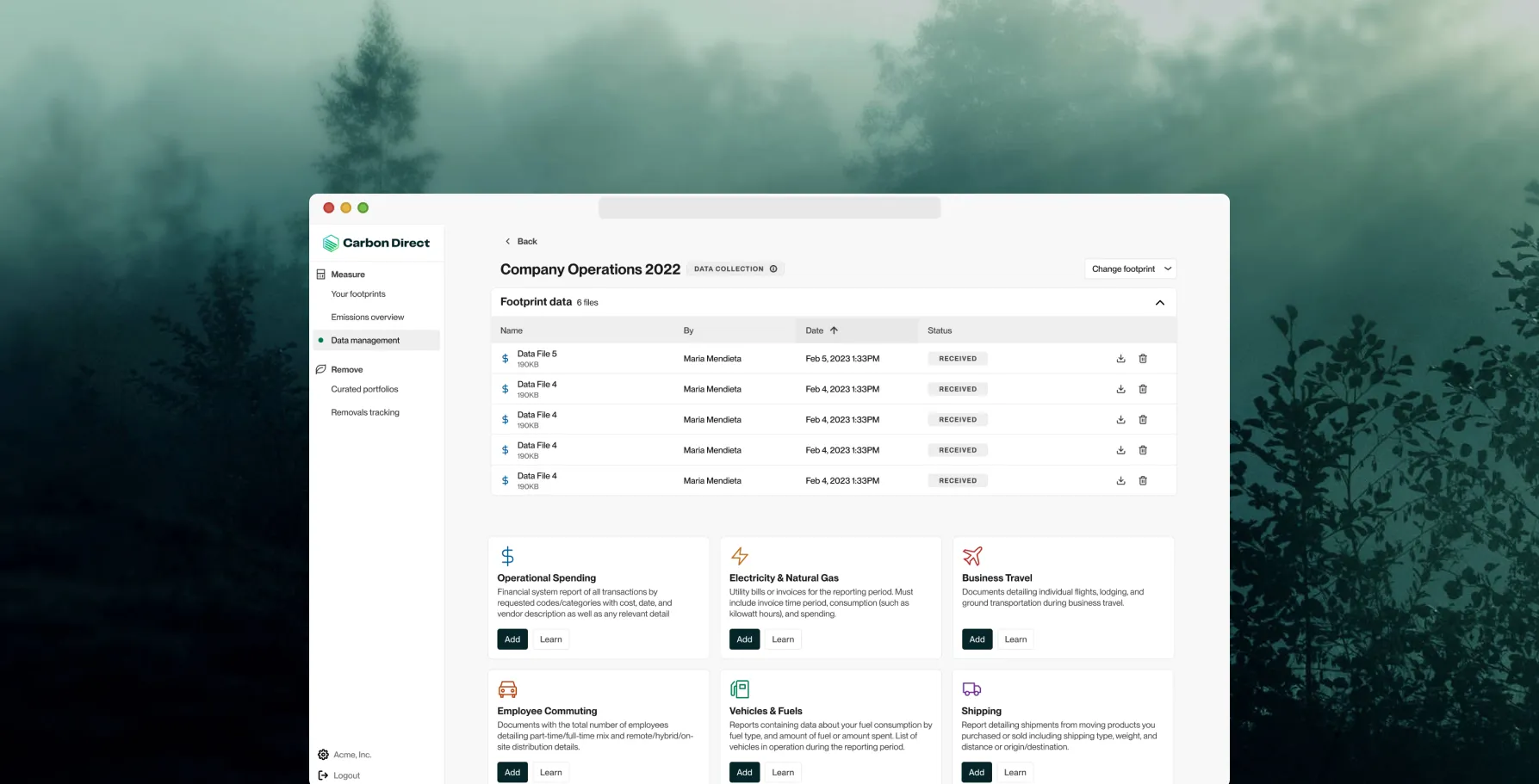
Phase 1 — guidance and upload. Rewrote the instructions for exporting spend data out of accounting systems, working from our own finance team’s feedback. Moved the upload out of a modal onto a full page with a drop zone, so customers could review the file instead of committing blind.
Phase 2 — pre-formatting. Our accounting team was manually cleaning every upload. We auto-detected fields and mapped them, then put the customer in a review step to confirm.
That review step was slower by design. Silent mis-mapping corrupts a footprint number a company may publish.
Outcome
I left shortly after release, so the analytics never got gathered. What the team planned to measure:
- Customers sharing correct spend data without manual guidance
- Time in the upload feature before a first attempt
- Uploads before the correct data landed
- Volume of customer questions about collecting spend data
Naming the measures without reading them is its own lesson: instrumentation has to land before the designer does.