BuiltKojo Technologies2025
Cutting hours of manual entry out of construction quoting
Vendors were hand-keying hundreds of line items on quotes worth millions. I led the workflow redesign from onboarding through document scanning to review.
- My role
- Workflow design lead — current-state analysis, journey mapping, interaction design, usability testing
- Focus
- Product design, Analysis, User testing, UI/UX
- Outcome
- 701 unique users and 459 PDFs scanned in release week
Context
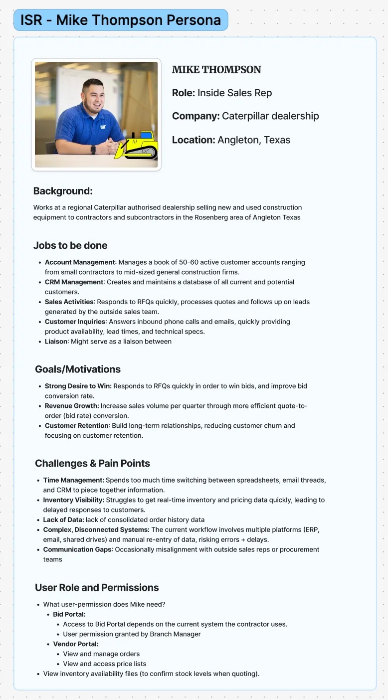
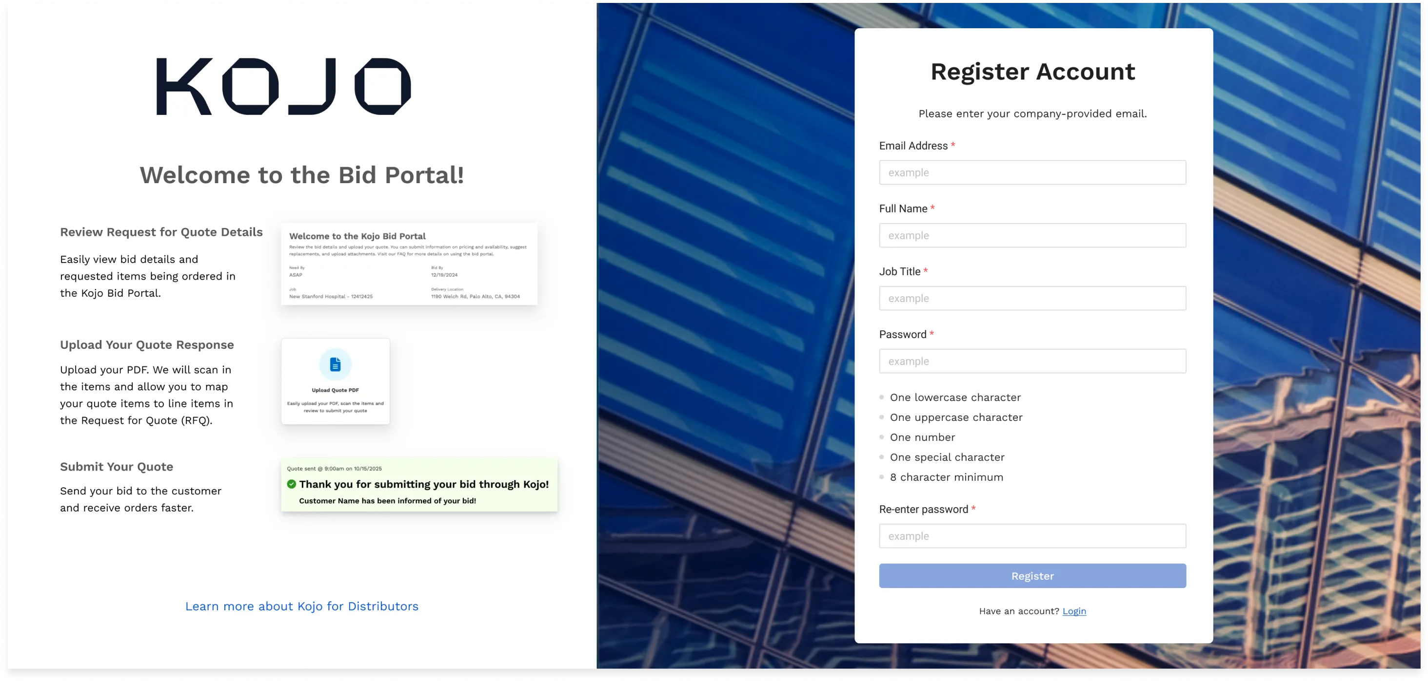
Kojo is a construction materials inventory platform. I led the workflow design for vendors responding to requests for quotes — onboarding through document processing to review.
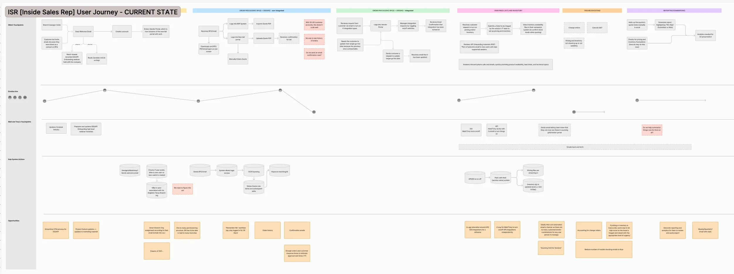
Vendors not yet integrated traded emails with customer success, then manually entered every line item. Line items run into the hundreds. The quotes run from hundreds of thousands to millions. A tedious step sat directly in front of the most consequential transaction these businesses make.
The key decision
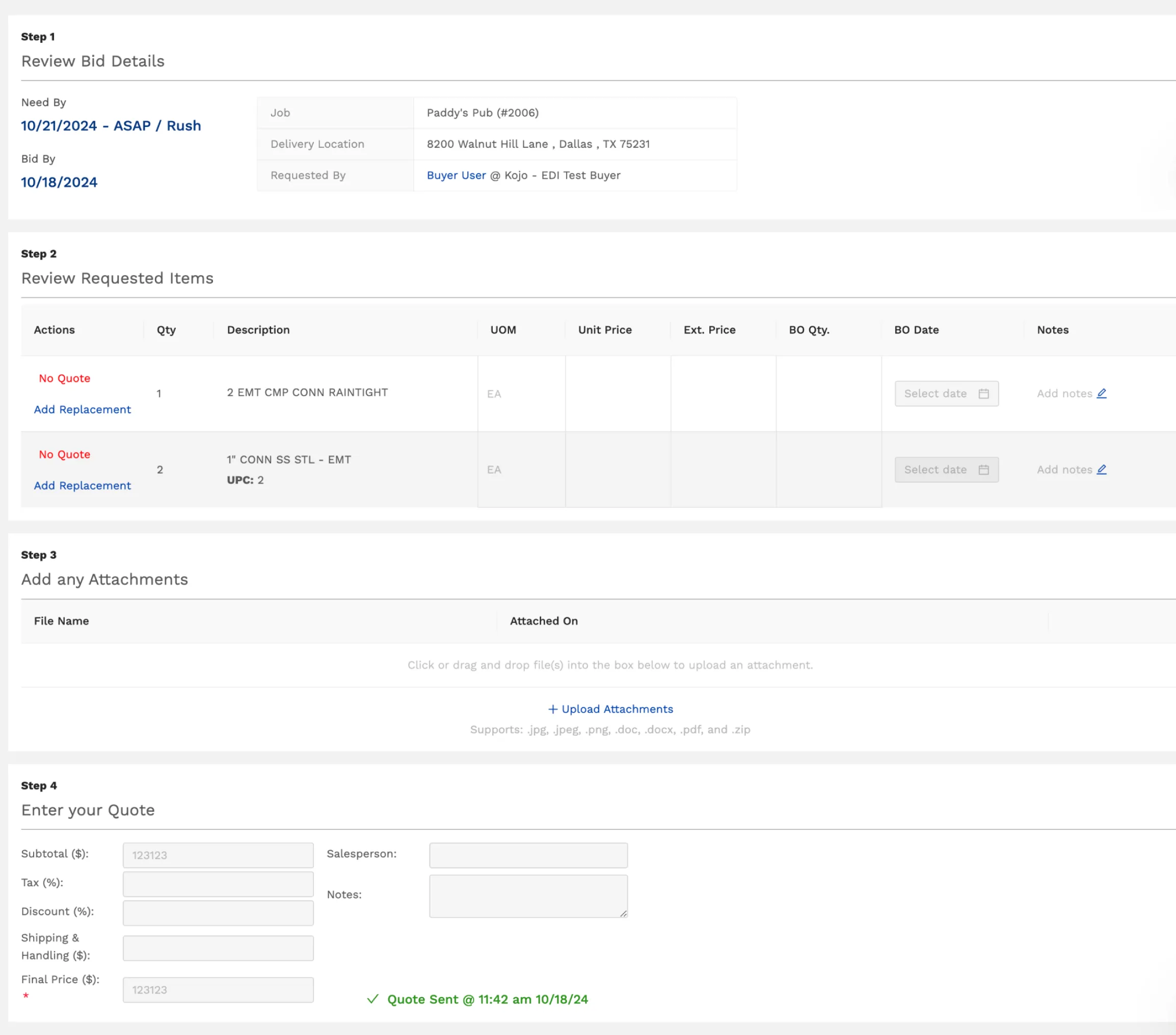
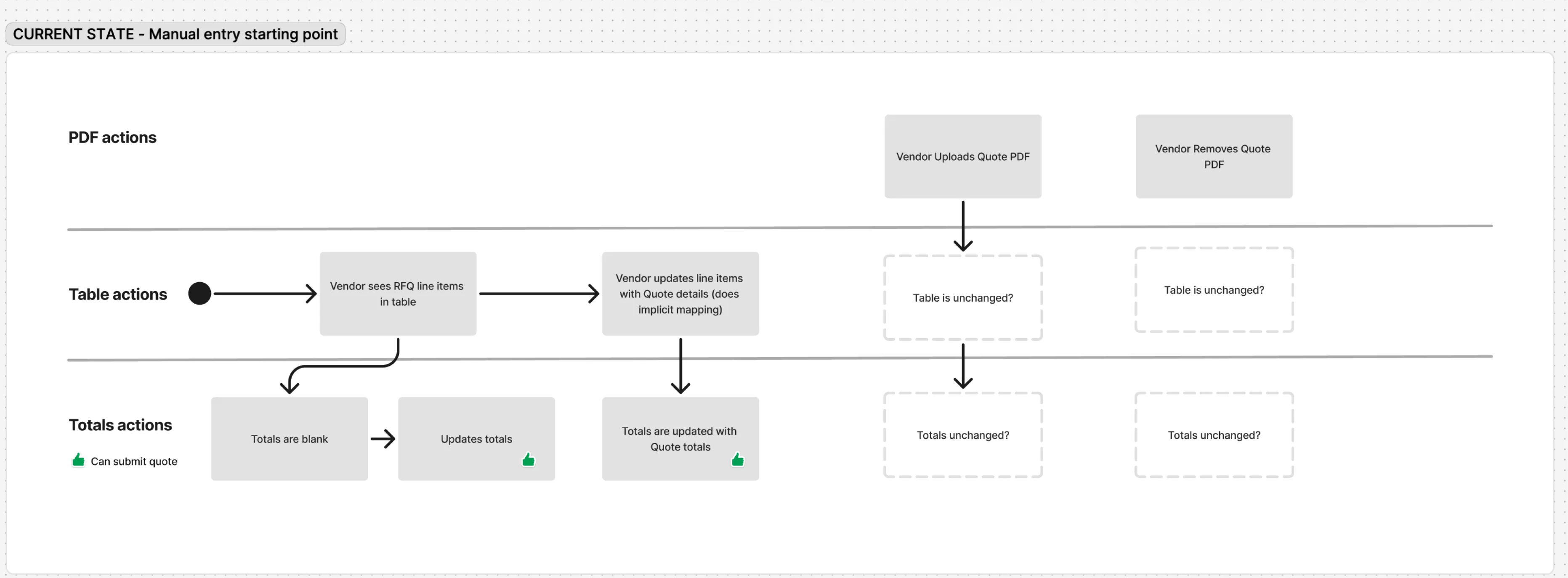
Start from recorded behavior, not the wireframes. I tested the existing designs internally and watched Fullstory recordings to find where vendors actually stalled. The redesign responded to real friction rather than assumed friction.
What I did
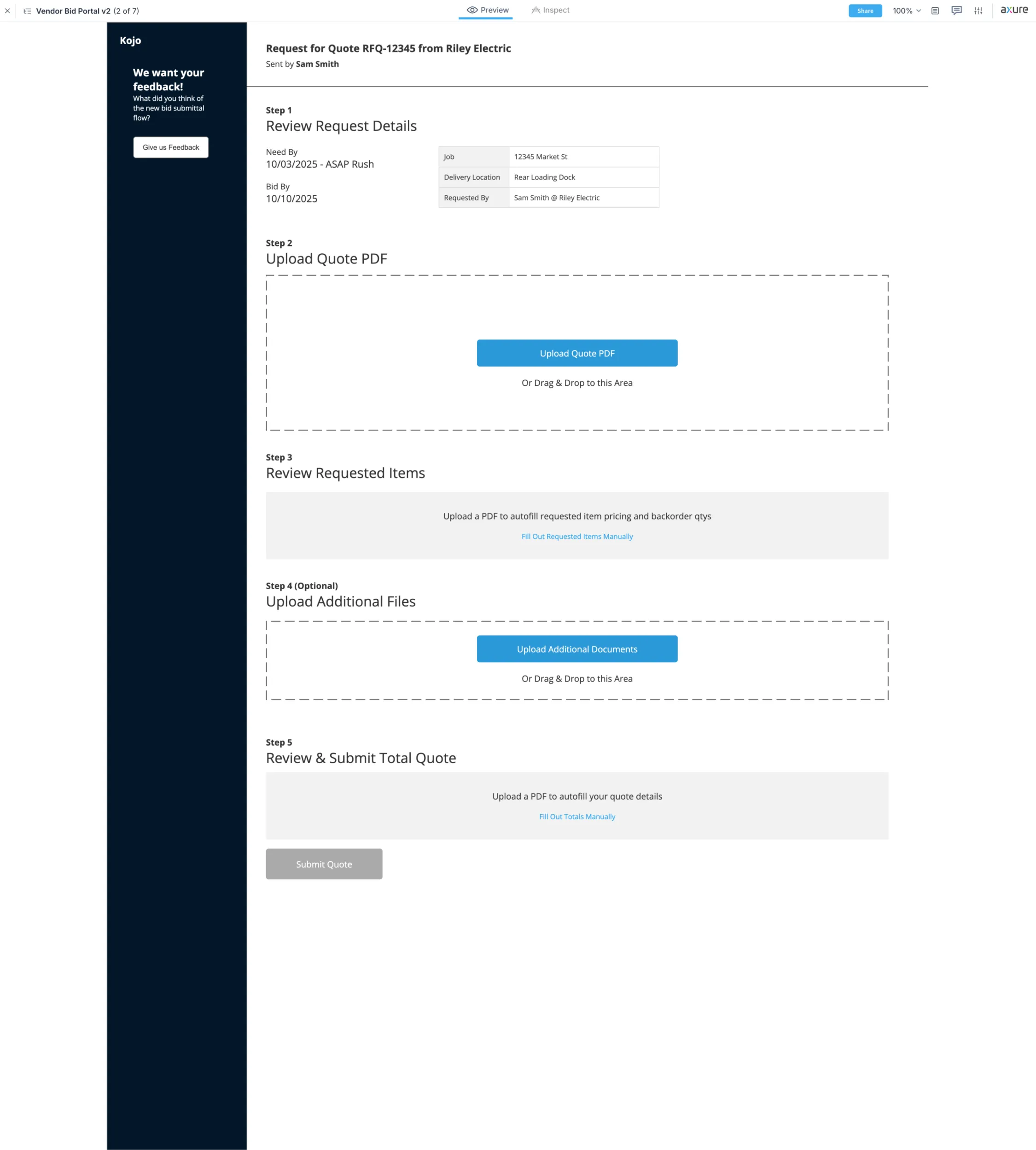
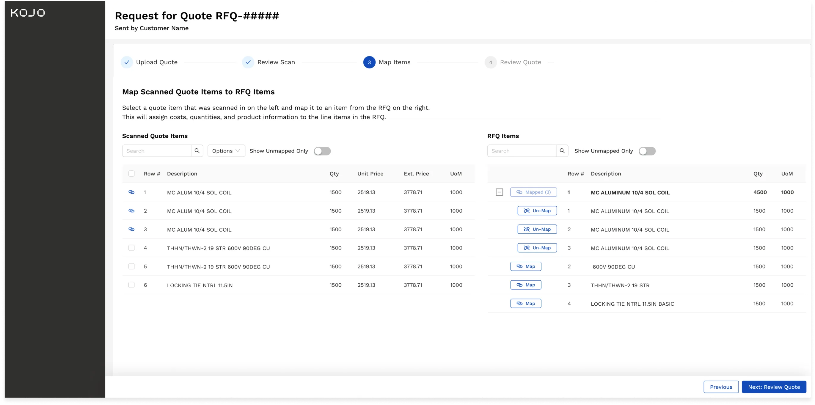
Three iterations, one page to stepper. The single-page version tested worse for a specific reason: on a quote with 300 line items, showing every stage at once meant vendors never knew whether they were done. Splitting it gave the work a visible end.
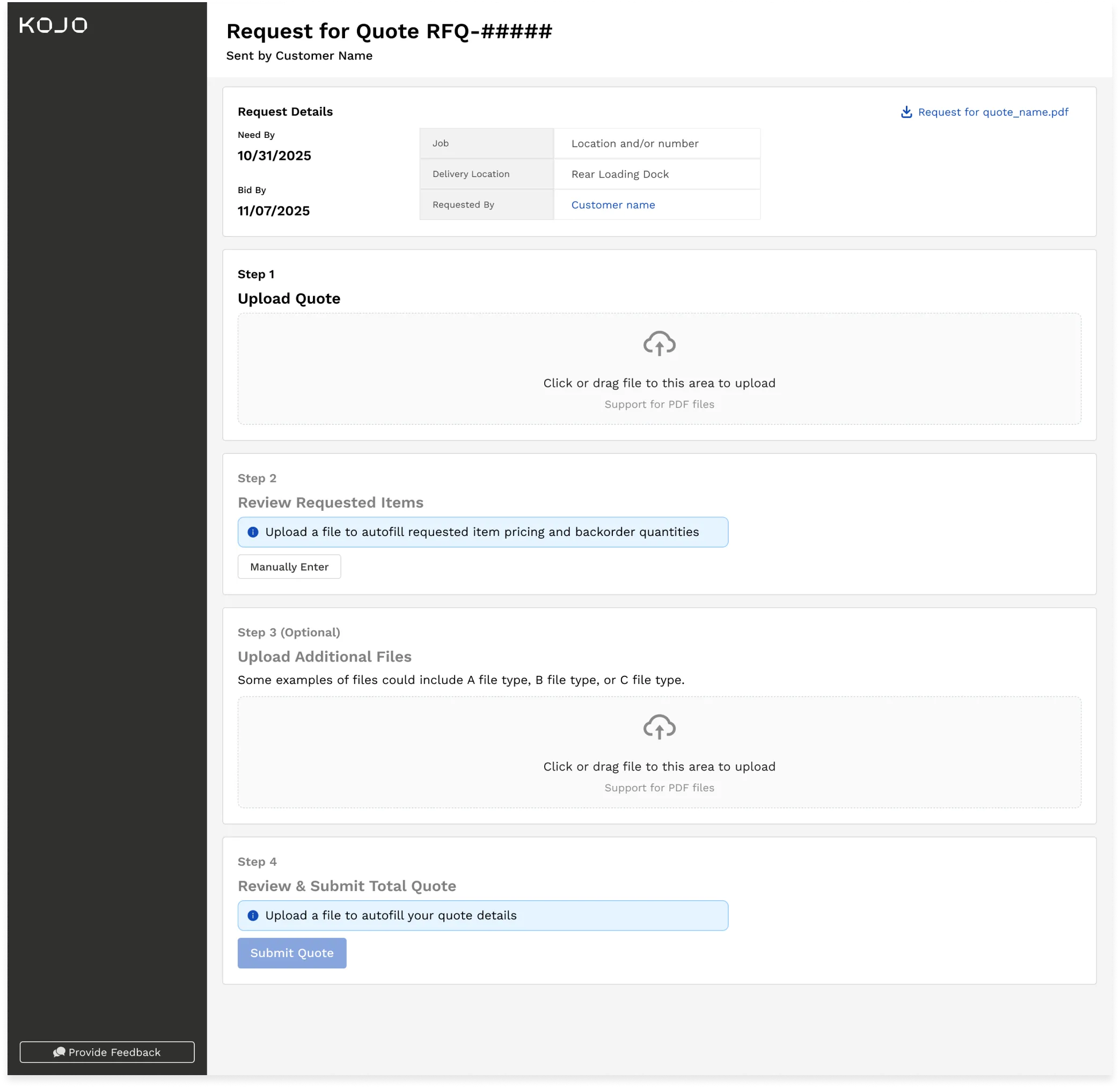
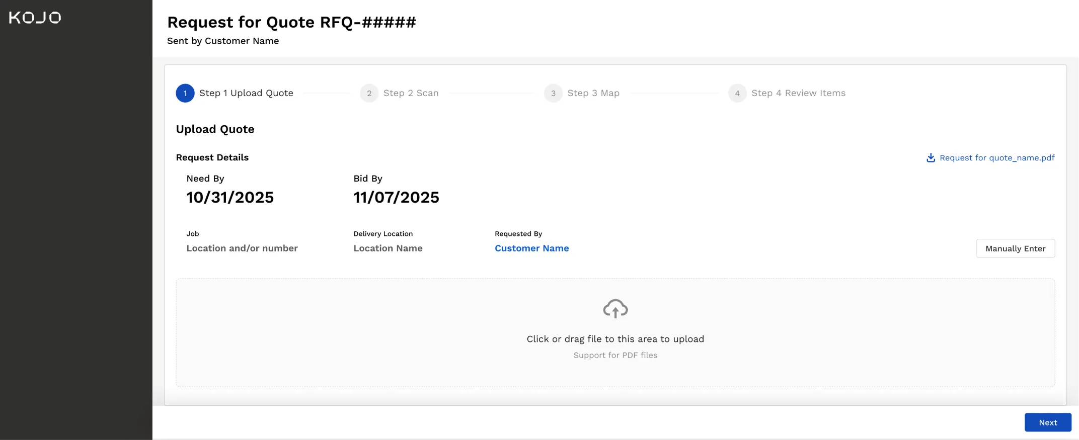
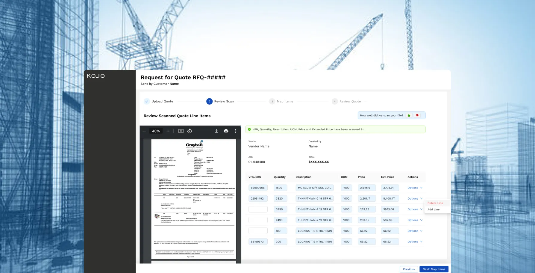
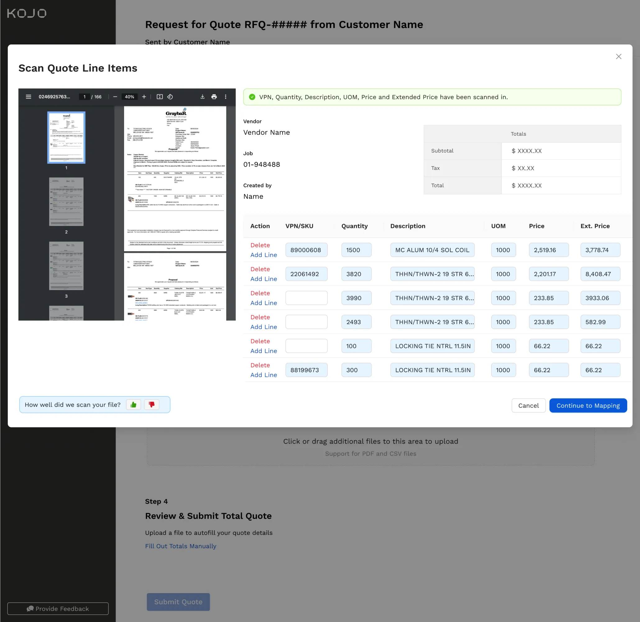
Kept the source PDF beside the extracted table. Vendors verify a scan without switching context — the step that decides whether they trust it.
Kept manual entry first-class, not a fallback.
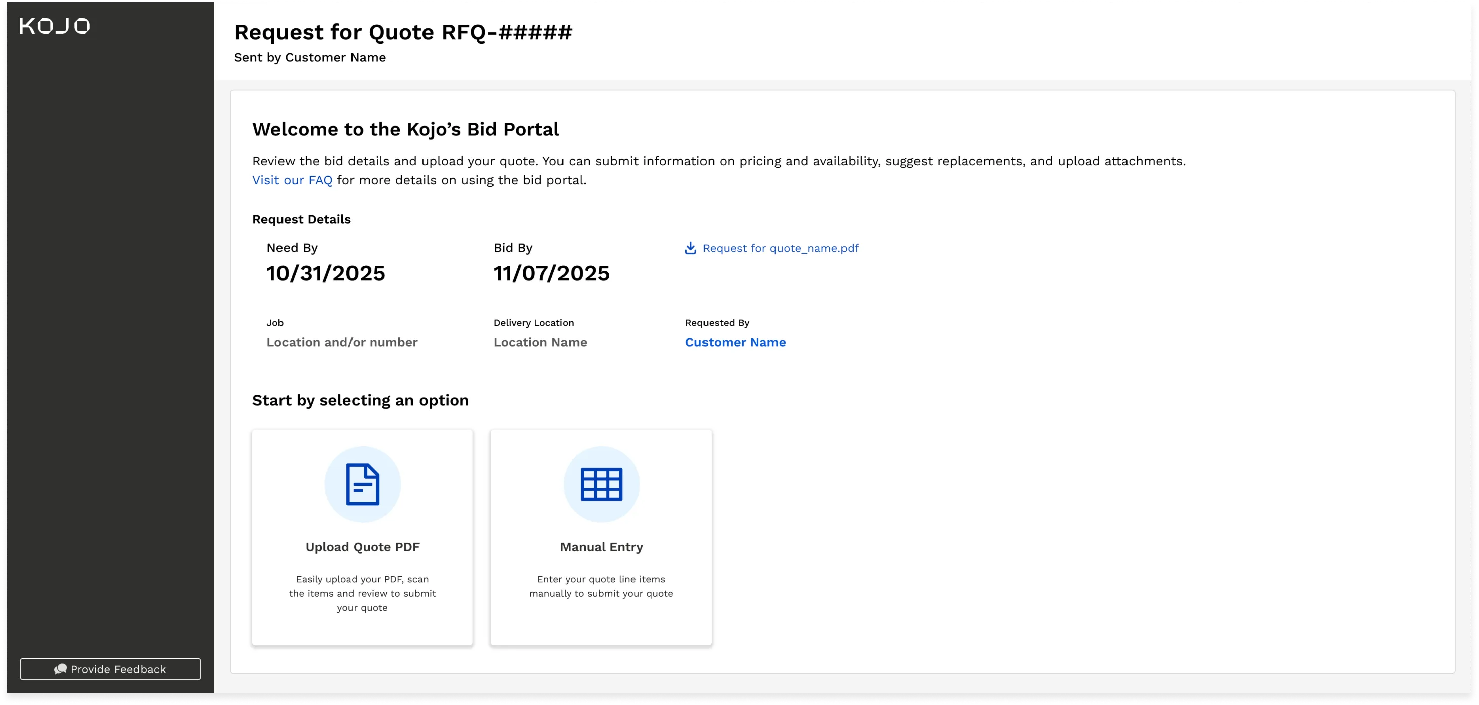
Tested with four participants — two internal, two external vendors. They understood the upload CTA and liked the dedicated pages. Fixes that came out of it: limit uploads to one file, rename the confusing “next” buttons, make scrollability obvious, consider bulk editing.
Outcome
Release week:
- 701 unique users on the new bid portal
- 459 PDFs scanned
- 333 quotes still entered manually
“You just saved me half the time it takes to enter a quote” — Tom, Commercial Pipe & Supply
The 333 is the honest number — a third of vendors bypassed scanning. That gap was next on my list.