LandCorteva Agrisciences2022
Getting 1.1 million acres of farmland through a data-entry gauntlet
Qualifying for carbon credits meant an enormous amount of manual data entry. I designed the structure, statuses, and bulk actions that got submission rates to 94%.
- My role
- Product designer — persona research, task flows, interaction design, testing with 12 farmers
- Focus
- Product design, UX research, Interviews, UI/UX
- Outcome
- 1.1M acres enrolled, 94% submission rate, 60% less CS time
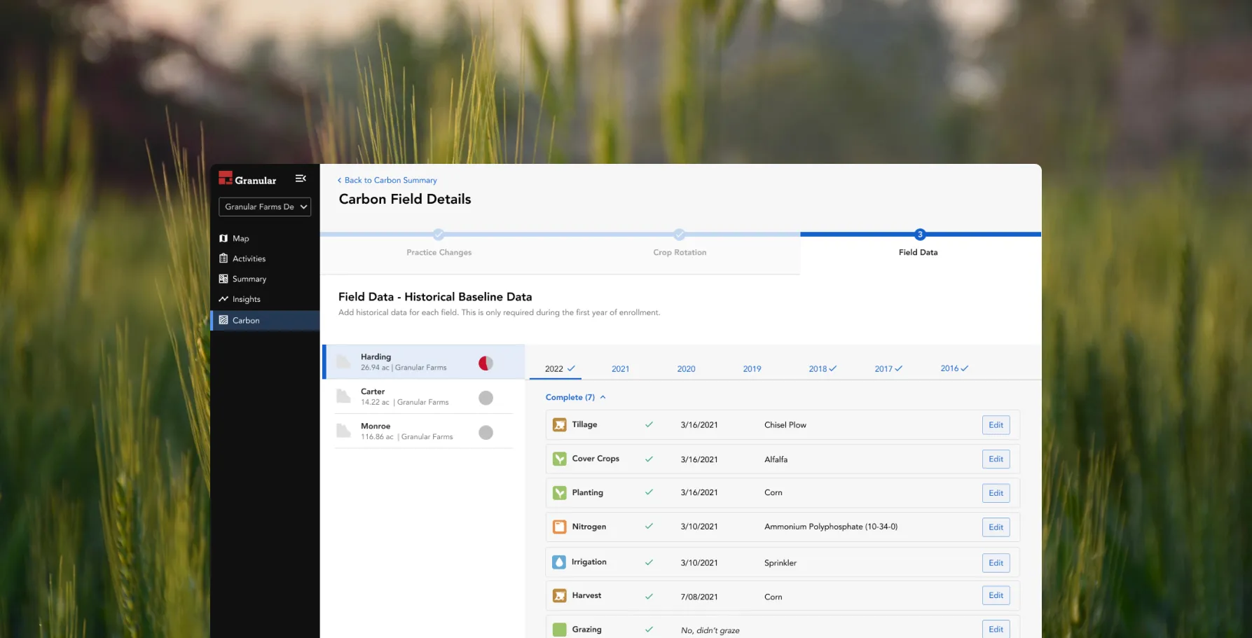
Context
The Corteva Carbon Initiative generates registry-issued carbon credits for farmers at scale. Farmers enter their practice change data into Granular Insights, Corteva’s free tool for measuring impact and earning additional income.
Qualifying takes an enormous amount of data entry — on top of actually farming.
The key decision
Most participants adopt practice changes for agronomic reasons and treat carbon payment as a bonus. So the product couldn’t use the payout as the reward for finishing a long form. The reward had to be legible progress and confidence the data was right.
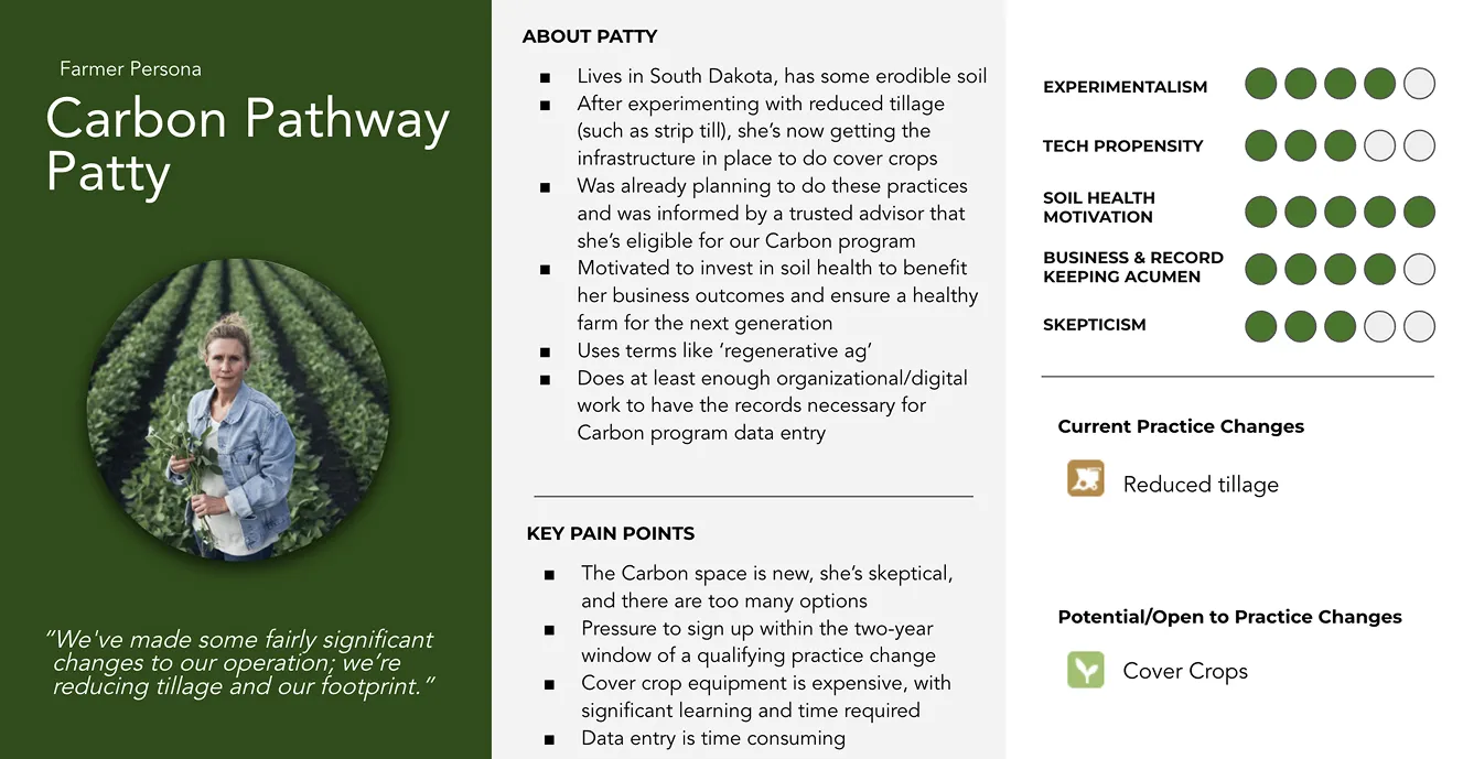
What I did
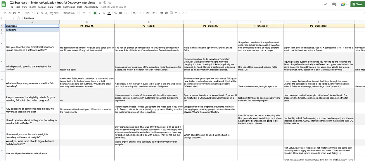
Mapped the work with the people fielding the complaints. Journey mapping with customer success surfaced the questions the product should have been answering itself.
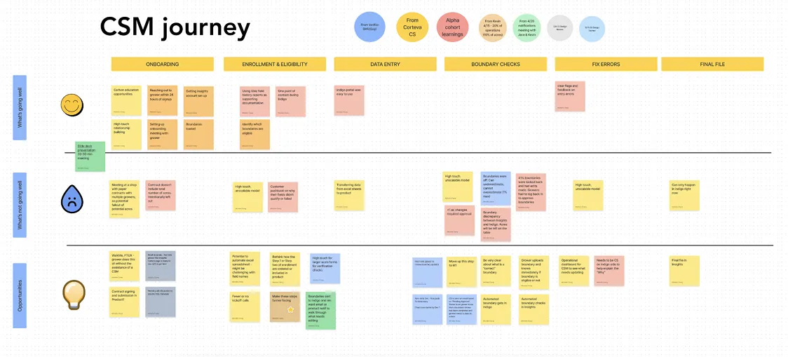
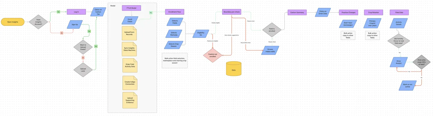
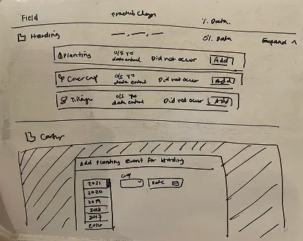
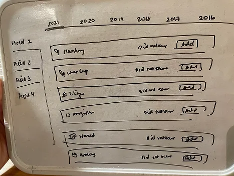
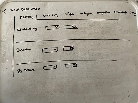
Tested three information hierarchies with 12 farmers. Farmers organize records in strikingly different ways, so I sketched all three plausible orderings rather than polishing one. Cheap sketches are easier to disagree with than finished screens.
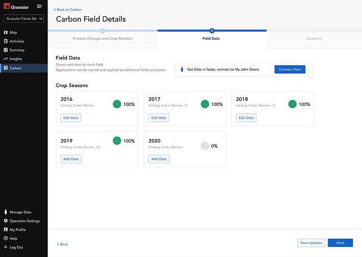
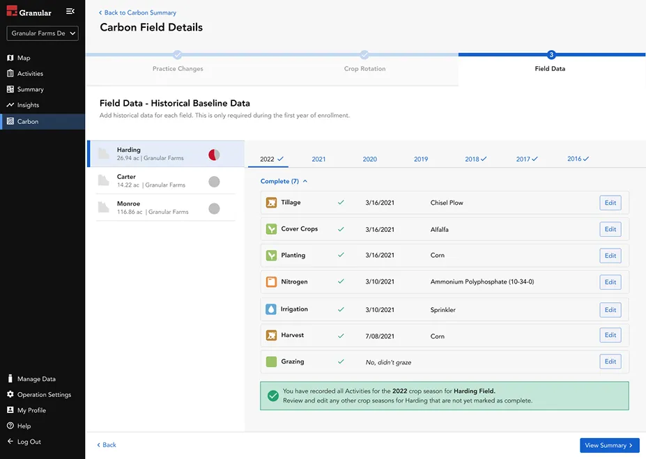
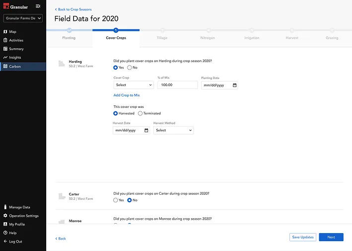
Cut the form down conditionally, so farmers who skipped a practice never see its questions.
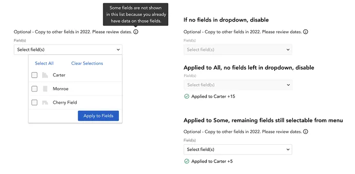
Added bulk actions after feedback that manual entry got repetitive. The edge cases carried the work — what happens when some fields are already filled, and when none are left.
Outcome
- 1.1M acres enrolled across 31 states
- 94% submission rate
- 60% reduction in customer success time
The 60% is the one I point to: product guidance replaced a human explaining the same thing over and over.