OceanSofar Ocean2024
Making non-adherence explainable at sea
Captains deviate from routing guidance for good reasons. I designed the layer that let shoreside operators see why, instead of just seeing a lower score.
- My role
- Product design lead — research, interaction design, and data visualization
- Focus
- Product design, UX research, Data viz, User testing
- Outcome
- Beta with one customer, then released to all customers
Context
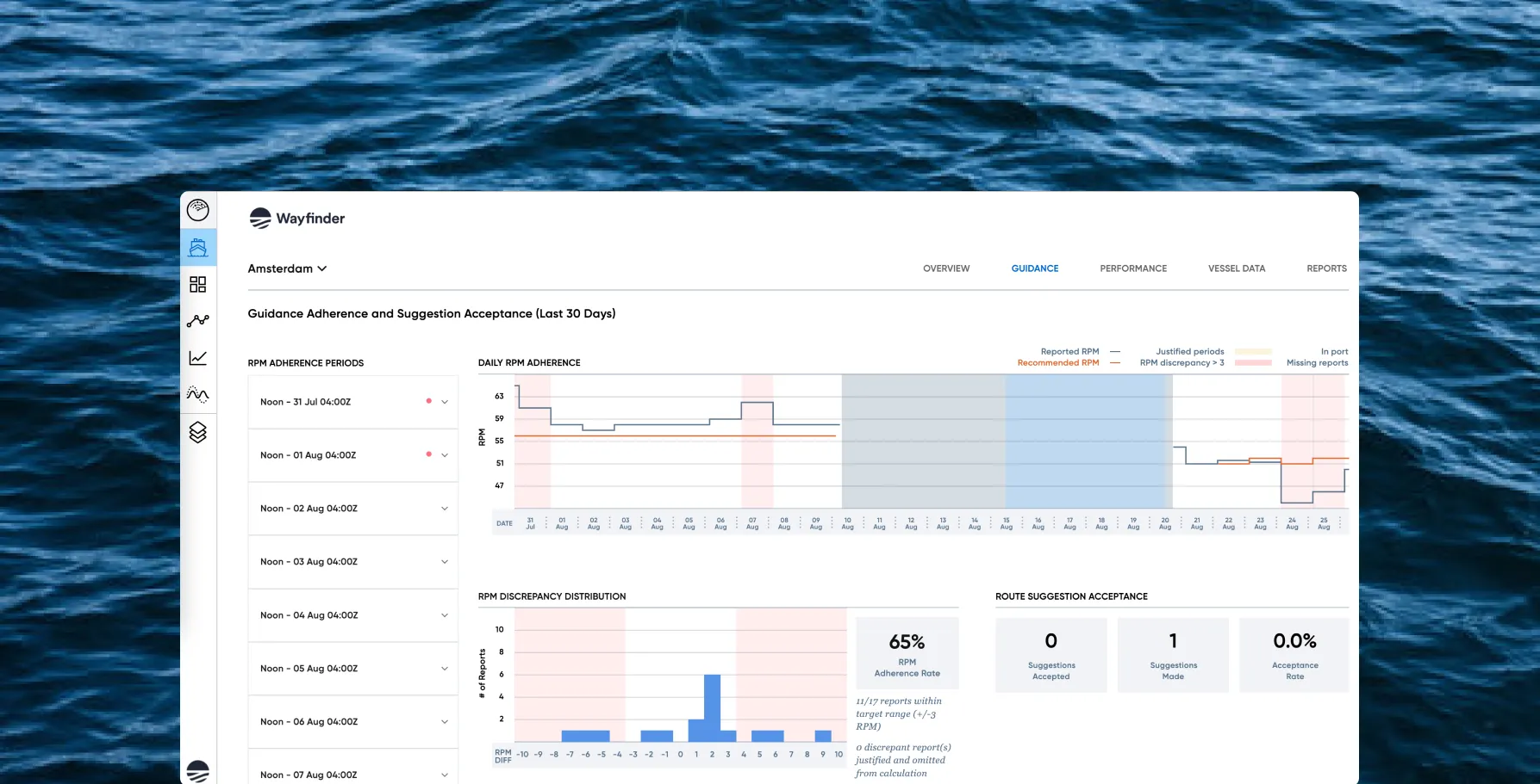
Sofar’s Wayfinder platform evaluates millions of routes a day and tells captains when a better path to port opens up. It also sends a daily RPM recommendation.
Captains don’t always follow it — and they’re often right not to. Conditions shift, and what’s happening at sea doesn’t appear in a forecast model. But every deviation lowered the vessel’s adherence score, leaving shoreside operators with a number that said something went wrong without saying what.
How can we allow shoreside operators to reasonably justify when captains do not adhere to our recommendations?
The key decision
Justification, not compliance.
The obvious response to a low score is to push harder on adherence. That treats the captain’s judgment as the defect — when the captain has the most information about the actual sea state. Everything else followed from refusing that framing.
What I did
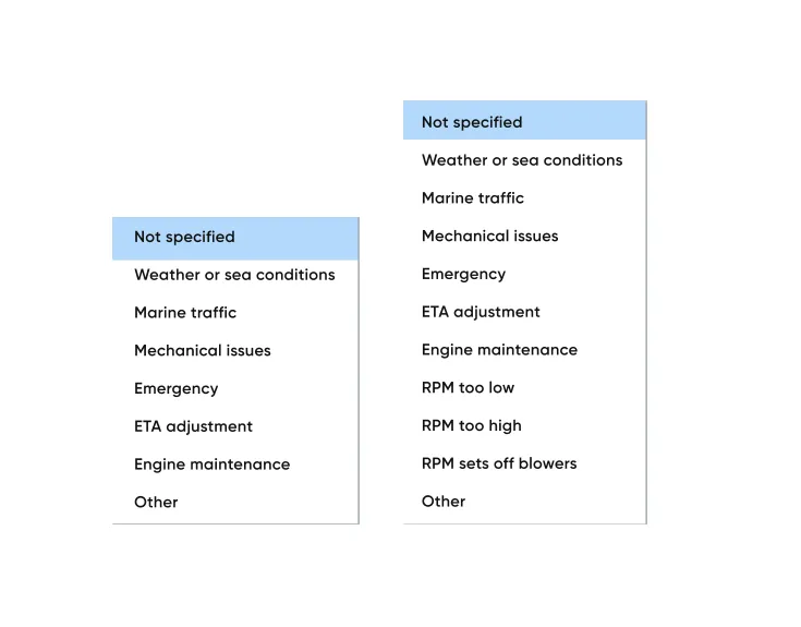
Built the vocabulary from customers. I asked what situations most often required departing from guidance. Those answers became the reason taxonomy.
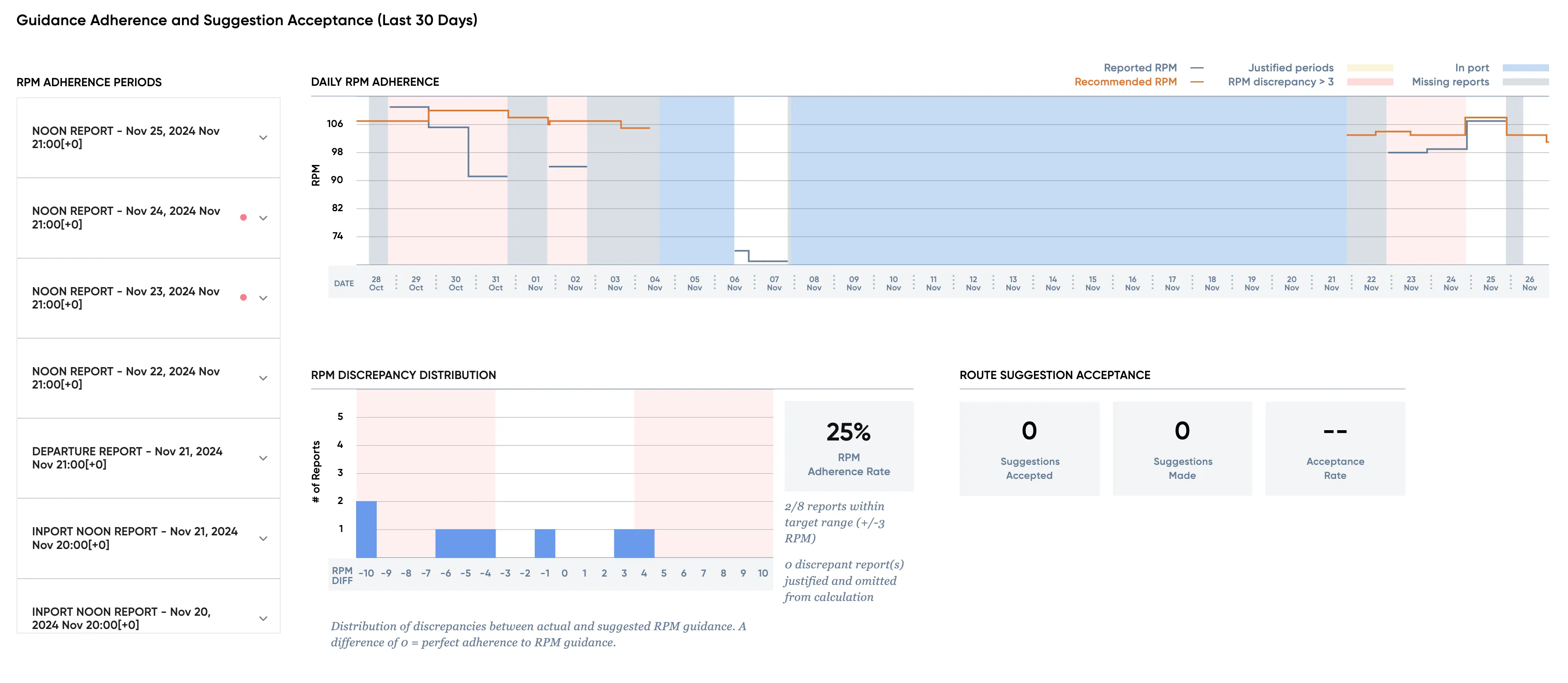
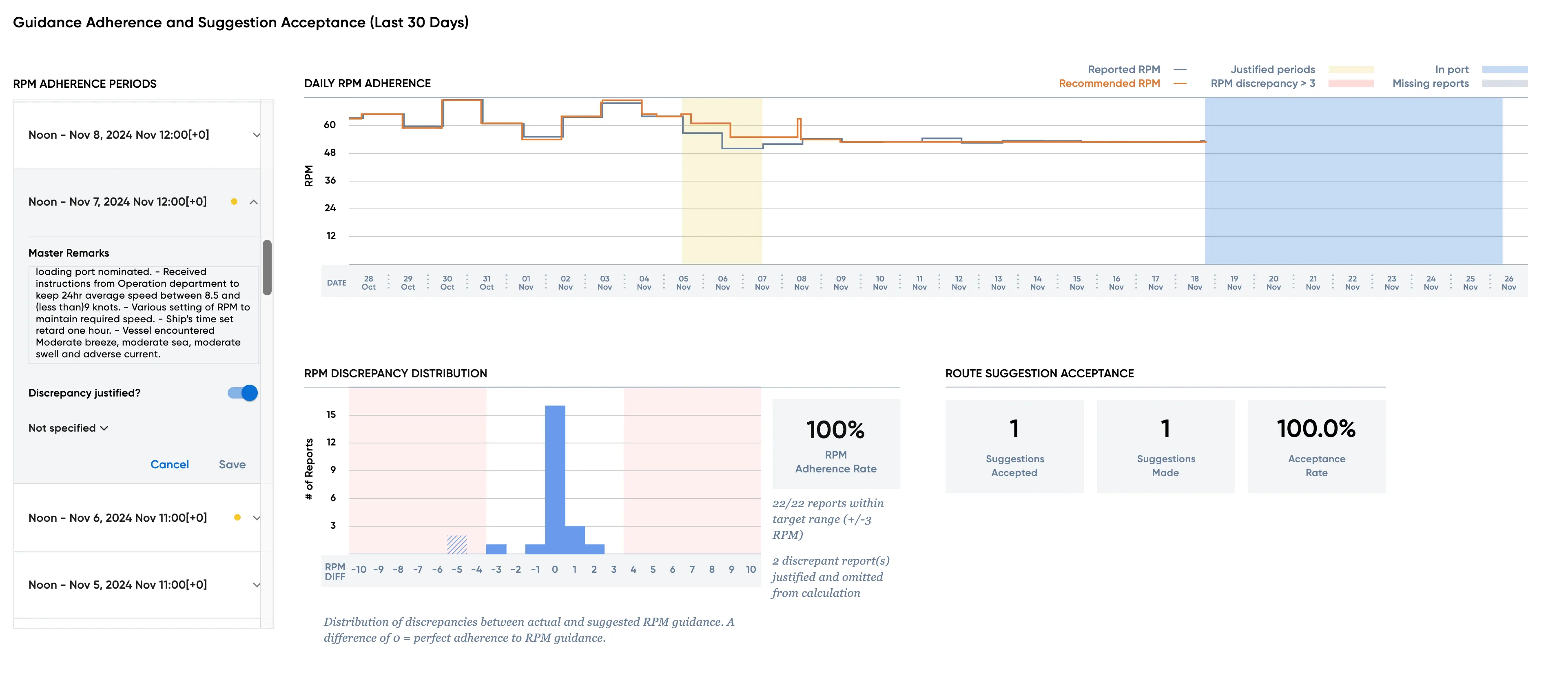
Put the reasoning next to the data. A column of notifications runs alongside the adherence graph. Selecting one highlights the matching day on the chart.
A separate tab would have been cleaner to build. Side by side forces operators to read cause and effect together, which is the whole point.
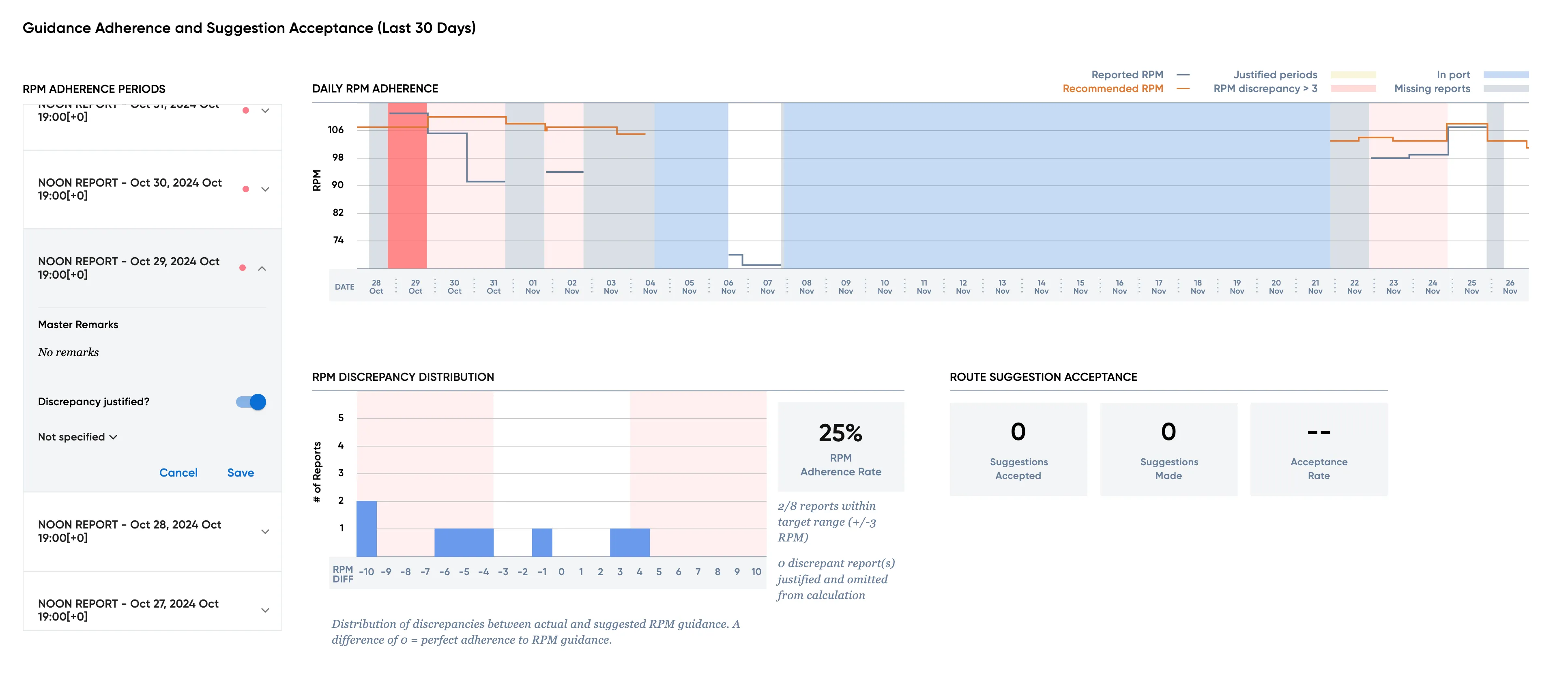
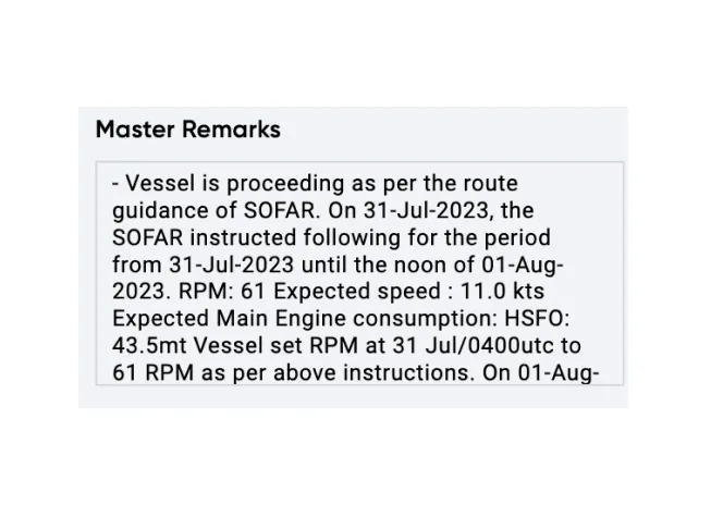
Kept the captain’s own words. Master remarks surface verbatim. Paraphrasing them into a status would have defeated the purpose.
Outcome
Beta with one target customer, then released to all customers after several weeks of positive feedback.
“One of the best tools you have prepared!” — Star Bulk